Resize Grip
Recently, we’ve released Stack WM 2.0, that added permanently visible elements. In this blog post I am going to show you, how I used them to add a grip to my vertical layout, that lets me redistribute space between the bottom and the top zones.
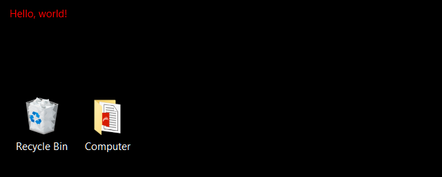
Hello, world!
Permanently visible elements is a new superpower of Stack, that you will see explored further here in the coming months, but we should start with something simple. We will make a “Hello, world!” layout, that simply shows “Hello, world!” on the screen. You will see how incredibly simple it can be.
Here’s what you need to do:
- Create a new layout (tray menu -> Edit Layout -> New)
- Give it a name (I used “Hello World”)
- Next, open it in your text editor of choice (I recommend free Visual Studio Code)
You’ll see something like this:
<Grid
    xmlns="http://schemas.microsoft.com/winfx/2006/xaml/presentation"
    xmlns:d="http://schemas.microsoft.com/expression/blend/2008"
    xmlns:mc="http://schemas.openxmlformats.org/markup-compatibility/2006"
    xmlns:sys="clr-namespace:System;assembly=mscorlib"
    xmlns:x="http://schemas.microsoft.com/winfx/2006/xaml"
    xmlns:zones="clr-namespace:LostTech.Stack.Zones;assembly=Stack"
    zones:Layout.Version="2"
    mc:Ignorable="d"
    Width="1024" Height="576"
    d:DesignWidth="1024"
    d:DesignHeight="576"
    x:Name="Root"
>
  <Grid.Resources>
    ...
  </Grid.Resources>

  <Grid.ColumnDefinitions>
    ...
  </Grid.ColumnDefinitions>

  ...
</Grid>
Note that zones:Layout.Version="2" at the top is important, it tells Stack, that this layout uses 2.0 features, and should be permanently visible.
Remove everything inside <Grid …></Grid>, and put this instead: <TextBlock Foreground="Red">Hello, world!</TextBlock>. Save it.
Now go to the Stack menu for your screen, and load your new layout. If you did everything correctly, this is what you will see:
Now this layout might not be very useful, considering there are no zones :) , but it demonstrates a powerful concept: you can decorate your desktop with Stack in a very customizable way.
For example, here’s markup to add white Stack logo to your layout:
<Grid Width="40" Height="30" HorizontalAlignment="Left" VerticalAlignment="Top">
      <Grid Margin="3">
          <Grid.RowDefinitions>
              <RowDefinition Height="1*"/>
              <RowDefinition Height="1.5*"/>
          </Grid.RowDefinitions>
          <Grid.ColumnDefinitions>
              <ColumnDefinition Width="3*"/>
              <ColumnDefinition Width="2*"/>
          </Grid.ColumnDefinitions>

          <Border BorderBrush="White" Grid.Column="0" Grid.Row="0" BorderThickness="3,3,0,3"/>
          <Border BorderBrush="White" Grid.Column="1" Grid.Row="0" BorderThickness="3"/>
          <Border BorderBrush="White" Grid.ColumnSpan="2" Grid.Row="1" BorderThickness="3,0,3,3"/>
      </Grid>
  </Grid>
If you’ve ever worked with Inkscape, it can save vector images in a compatible format: choose Microsoft XAML when saving. You’ll get something like this:
<?xml version="1.0" encoding="UTF-8"?>
<Viewbox xmlns="http://schemas.microsoft.com/winfx/2006/xaml/presentation" Stretch="Uniform">
  ...
</Viewbox>
You should be able to copy and paste the entire Viewbox into your layout where you want it to be. (drop the xml part)
The Grip
Stack is based on Microsoft WPF, which provides a lot of powerful controls, that you can now use to customize your screen.
Most of layouts already use <Grid> and <Border> controls for the basic functionality.
You can also use <TextBlock> as shown above, or add an <Image> (see how).
We will try to explore what is available in this blog later, and see how you can use it in Stack to get some cool behaviors.
Today, we will focus on <GridSplitter> (more details).
<GridSplitter> is a control, that allows you to dynamically resize rows or columns in your layout’s Grids with mouse.
The idea is simple: add a Row or a Column to your layout between the zones you want to resize,
put a <GridSplitter> into it, and let it handle the rest. For example:
<GridSplitter Grid.Row="1" Height="6"
              ResizeDirection="Rows" ResizeBehavior="PreviousAndNext"
              HorizontalAlignment="Stretch" VerticalAlignment="Top" />
Turns into:
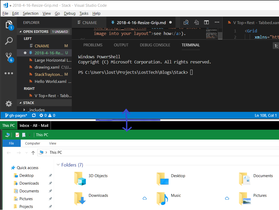
Now you can grab the splitter (marked violet) with mouse, and resize top and bottom zones together.
Be careful when inserting splitter next to WindowTabs.
If you do it blindly, the tabs will be resized instead of the zone below them.
To circumvent that in my example I put tabs and splitter into the same row,
and set Margin="0,6,0,0" on tabs to leave area above them for the splitter. Here’s the full example:
<Grid
    xmlns="http://schemas.microsoft.com/winfx/2006/xaml/presentation"
    xmlns:d="http://schemas.microsoft.com/expression/blend/2008"
    xmlns:x="http://schemas.microsoft.com/winfx/2006/xaml"
    xmlns:zones="clr-namespace:LostTech.Stack.Zones;assembly=Stack"
    xmlns:mc="http://schemas.openxmlformats.org/markup-compatibility/2006"
    mc:Ignorable="d"
    Width="576" Height="1024"
    zones:Layout.Version="2"
    d:DesignWidth="576"
    d:DesignHeight="1024"
    >
  <Grid.RowDefinitions>
    <RowDefinition Height="*"/>
    <RowDefinition Height="Auto"/>
    <RowDefinition Height="4*"/>
  </Grid.RowDefinitions>

  <zones:Zone x:Name="Full" Grid.RowSpan="4"/>

  <zones:Zone Grid.Row="0"/>

  <GridSplitter Grid.Row="1" Height="6"
                ResizeDirection="Rows" ResizeBehavior="PreviousAndNext"
                HorizontalAlignment="Stretch" VerticalAlignment="Top" />

  <zones:WindowTabs Grid.Row="1" Margin="0,6,0,0"
                   ItemsSource="{Binding Windows, Source={x:Reference Main}}"/>

  <zones:Zone x:Name="Main" Grid.Row="2"/>

  <Border Grid.RowSpan="3" Height="160" VerticalAlignment="Bottom" Background="#44F"
          zones:Layout.IsHint="True">
      <!-- Find more symbols from Segoe UI Symbol in Character Map app -->
      <TextBlock HorizontalAlignment="Center" VerticalAlignment="Center"
                  FontFamily="Segoe UI Symbol" Foreground="White" Text="⇕" FontSize="80"/>
  </Border>
  <zones:Zone Grid.RowSpan="3" Height="160" VerticalAlignment="Bottom"
              Target="{Binding ElementName=Full}"/>
</Grid>
Security warning!
Stack layouts use very powerful extensibility mechanism, built on WPF. In theory, one can make any program to be part of their layout. However, this mechanism can be used for hacking.
DO NOT USE LAYOUTS FROM PEOPLE YOU DO NOT TRUST!
Questions?
If you have any questions, feel free to ask our community.